Boardroom Definition
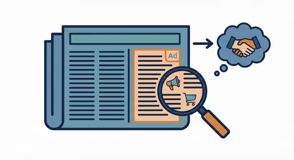
A Call to Action (CTA) is a text prompt, button, or graphic instruction intended to persuade a user to perform a specific act immediately. It serves as the bridge between marketing content and business value, guiding the user toward a conversion goal. Common examples include "Sign Up," "Learn More," or "Buy Now." It is the decisive component that transforms a passive impression into an active click.
The effectiveness of a CTA is primarily measured by the Click-Through Rate (CTR).
CTR Formula = (Total Clicks / Total Impressions) * 100
However, advanced planners optimize for Click-to-Conversion Rate (CVR) to measure the quality of the CTA, ensuring it sets the right expectation.
CVR Formula = (Total Conversions / Total Clicks) * 100
- High CTR, Low CVR: Suggests the CTA ("Free MacBook") was misleading or "clickbait," leading to a high bounce rate.
- Low CTR, High CVR: Suggests the CTA ("Buy $5,000 Watch") was highly specific, filtering out unqualified leads before they clicked (saving money on CPC).
The Real Scoop
In 2026, the era of "Click Here" is dead. The "Insider" reality is that the CTA acts as a Psychological Gatekeeper. It sets the "Friction Expectation" for the user.
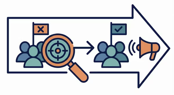
- Soft CTAs ("Learn More," "Watch Video"): Signal low commitment. Used for upper-funnel awareness to maximize click volume.
- Hard CTAs ("Shop Now," "Subscribe"): Signal high commitment (financial or data exchange). Used for lower-funnel retargeting.
Using a Hard CTA on a "Cold" audience (someone seeing your brand for the first time) destroys performance. It’s like asking for marriage on the first date. Furthermore, platform algorithms scan CTAs; generic phrases like "Click Here" often trigger spam filters, while descriptive actions like "Download the Guide" improve Ad Rank.
Watch Outs
- The "Bait and Switch": If your CTA says "Shop Sale" but links to a generic Homepage rather than the specific product page, you create friction. Users will bounce immediately. The CTA promise must match the Landing Page reality.
- Platform UI Blindness: On platforms like TikTok or Instagram Reels, placing a text CTA at the bottom of the screen often results in it being covered by the app’s native interface (caption overlay, like button).
- Button Fatigue: Putting 3 different CTAs in one email or landing page ("Read this," "Buy that," "Follow us") creates "Choice Paralysis." The most effective assets have one single, clear objective.